 (+91) 8853765397
 NEWSLETTER
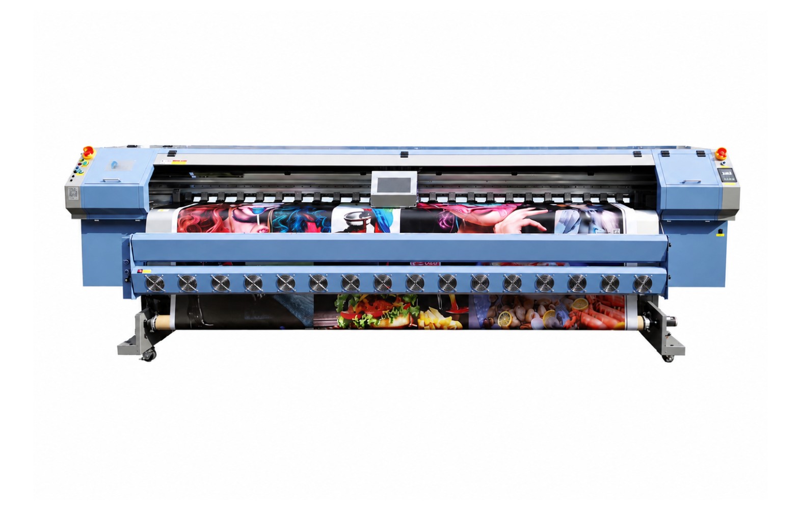


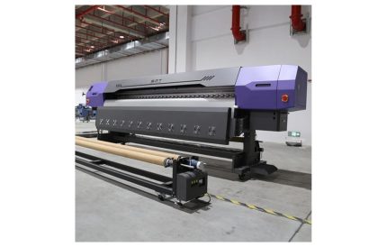
Flex Solvent Printer Konica 512 – Overview
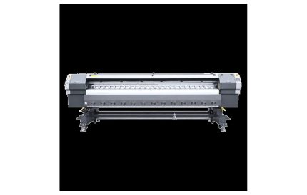
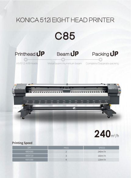
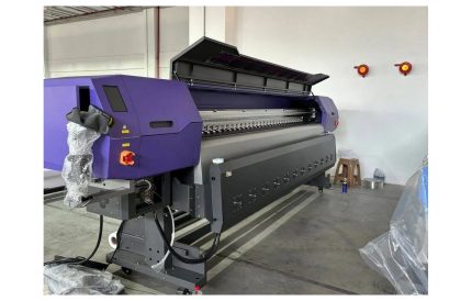
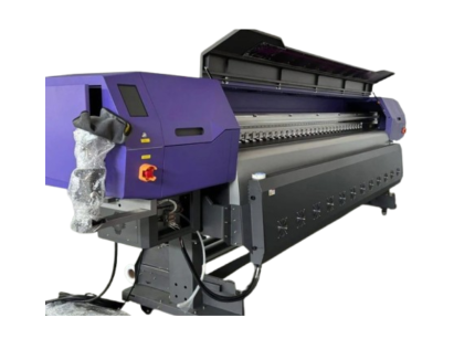
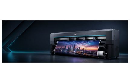
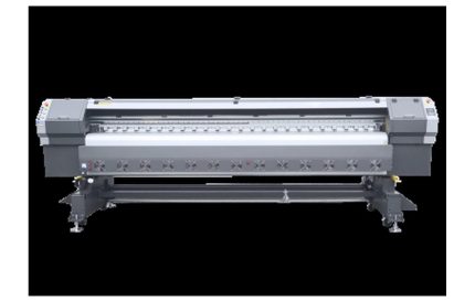
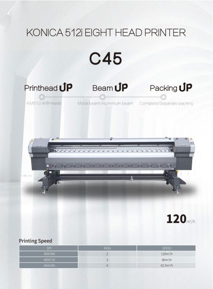
The Flex Solvent Printer Konica 512 is a large-format ~3.2 m solvent flex printer designed for reliable, high-quality printing. With Konica Minolta 512 heads, it delivers sharp, vibrant and durable output across a wide range of media, making it a dependable production asset for print shops and manufacturers.
Print Quality & Technology
Konica Minolta 512 heads micro-piezo inkjet printheads deliver fine, variable-size droplets for smooth gradients, sharp text and photographic detail. Consistent CMYK colour reproduction, accurate registration and reliable jetting make it suitable for day-in, day-out production.
Productivity & Build
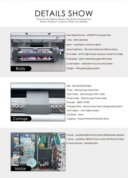
The machine features a rigid, heavy-duty frame with accurate media handling and tension control, reducing vibration so output stays sharp at working speeds. It is engineered for long, dependable production runs with minimal downtime.
Versatility & Applications
The Flex Solvent Printer Konica 512 prints on flex & banner, one-way vision, hoardings, backlit displays, plus a wide range of other substrates. This versatility makes it ideal for signage, décor, packaging, personalised products and industrial production work.
Low Running Cost
Bulk ink with continuous ink supply keeps cost per print low, while integrated heating or UV-LED curing helps ink set quickly for vivid, durable colour with minimal waste and faster turnaround.
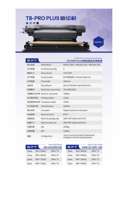
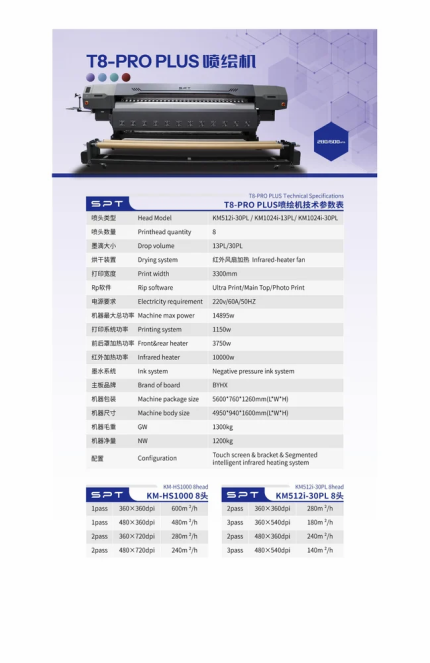
Technical Specifications
| Model | Flex Solvent Printer Konica 512 |
|---|---|
| Type | large-format ~3.2 m solvent flex printer |
| Print head | Konica Minolta 512 heads |
| Ink / Colour | CMYK |
| Media | flex & banner, one-way vision, hoardings, backlit displays |
What’s Included
- Complete machine with print carriage and ink system
- RIP software and drivers
- User manual and training support
- Warranty and after-sales technical support
Contact our team for current pricing, installation, training and service plans, or to book a demo.






Mr. Mackay –
I’ve heard the argument that “lorem ipsum” is effective in wireframing or design because it helps people focus on the actual layout, or color scheme, or whatever. What kills me here is that we’re talking about creating a user experience that will (whether we like it or not) be DRIVEN by words.